Back in the halcyon days of Digital Equipment Corporation (DEC) my team was “volunteered” to participate in a pilot process improvement effort called Software Metrics In Action (SMIA). As project leader of 10 engineers working on an 18 month project, we were a perfect candidate for this effort of inspecting and adapting and ultimately improving our software development methodology via Software Metrics. My participation in this process gave me valuable experience with process improvement. What I didn’t realize at the time was that I was being exposed to many of the key elements of the yet-to-be named Agile software development philosophy.
As I look back to that period of time, I recall measuring every piece of the software development process we could identify. Our team motto was “Data tells the truth about perception.” Seriously! We measured everything. We compared task effort ‘actuals’ with ‘predicted’. We tracked our time for development, test, vacation, dentist and doctor visits, even bathroom breaks, and we had graphs for every data series. But in the midst of this data collection and evaluation there was one metric that stood out. It was the one ultimate metric that the business owners, our management, was most focused on: the “work remaining”, specifically: when can we ship?
To track the answer to this question we kept a Microsoft Project schedule that contained only the remaining work. Each day we adjusted the start date of the project each day to the current day and recomputed the remaining schedule. As more project work got completed, our knowledge grew and so did our confidence in our task estimates and our release date. By continually refining our estimates based on new knowledge, we were able to track, in “real time”, the effective project completion date on a daily basis.
My teams effort in our1990’s pilot organically stumbled upon one of the key mechanisms Scrum uses today to track project status. Scrum monitors “work remaining” by using the concept of Burn Down, and in particular, Burn Down Charts.
Burn Down Charts
There are two types of burn downs that are generally tracked by a Sprint team, the Sprint Burn Down and the Release Burn Down. They both operate similarly, but have a different scope. The Release Burn Down most closely matched my DEC pilot schedule release date monitoring, as it tracks work remaining for the entire project. The Sprint Burn Down tracks work remaining within a single Sprint, usually 2-4 weeks long. Because the Progress Agile pilots were of such short duration, each Progress pilot focused solely on Sprint Burn Down Charts.
Understanding how to interpret these charts is important. As a business owner they provide a valuable and near-instant view into the health (or status), of the current effort, be it a Sprint or Release.
Reading the Charts
A burn down chart is laid out simply: The x-axis denotes number of days in the iteration (or project), the y-axis, for a Sprint Burn, is amount of available time in hours (for a release burn down, it is story points - topic for another blog). The numbers on this axis are computed by multiplying 8 (hours/day) times the number of team members, assuming each team member is full-time on the effort.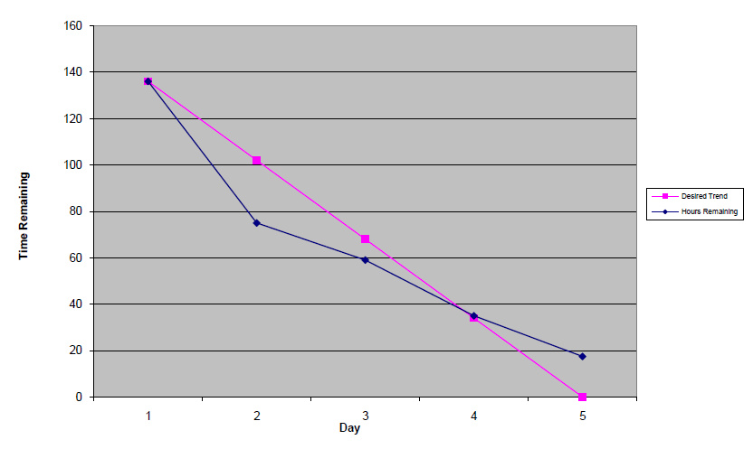
Reading a burn down chart is fairly simple once you understand what to look for. Burn down charts show a the rate of progress of work being completed compared to the ideal rate of completion of that work. All burn down charts have one thing in common: the ideal burn down line with the ideal slope. Note the pink line in the Sprint burn down chart taken from one of our Agile pilot teams. This pink line shows the ideal rate of progress, specifically that one day of work (8 hours times the number of team members) is completed each day. There are 5 days of work, the Sprint iteration is 5 days long, and at the end of the sprint, 5 days of team work should be completed.
The pink line is boring. It’s boring because it is our control value, it’s slope is always the same. In this chart, the interesting line is the blue line. The blue line denotes the predicted remaining work for the iteration, in essence the current remaining workload of the Sprint. If everything works out as we hope, at the end of the sprint, day 5 in this example, the blue line will converge exactly with the pink line, at zero work remaining (since there is zero time remaining!). If we examine this chart on day 2 and day 3, we can see that the team is ahead of schedule, because it is below our control line. Possibly the team under-committed to work, but regardless, at day 2 it looks like they are on track to meet their commitment to complete everything they said they would. By day 4 the team is exactly on track. But something happens by day 5 because they are half-day behind. Perhaps a team member became sick or perhaps the team discovered some major unknown work at the last day. Either way, this is likely a bad example I have chosen to discuss because the team missed their commitment and everyone only found out about it the last day. The retrospective for this Sprint must surely have been interesting! This chart introduces more questions than it answers, but it encapsulates a interesting story. It turns out that this sprint was a bug fix sprint, in essence a “release sprint”, designed to produce a customer-shippable technical preview kit. Bug fixing uncovered further bugs and the team was unable to fix everything they found in time for the release, the end of the sprint.
Yes, that burn down chart tells quite a story, a thousand words, as they say, and if you are the business owner, it’s your quickest and best view into each project team.
More Examples
Let’s look at a couple more burn down charts. In this chart the team is tracking close to the ideal progress line, the black line in this chart format.
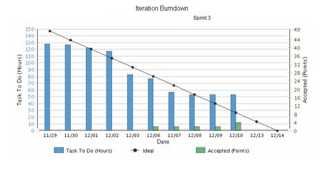
The remaining work, Task To Do blue bars, are flirting above and below the ideal. With 2 days remaining, it is likely this team complete all of their committed work. In fact, because the remaining work amount hasn’t changed the last few days, it suggests that an inquiry to the ScrumMaster might be needed to see if people simply haven’t been updating work remaining in their effort to complete the Sprint.
In this final chart below, it looks like the team has over-committed, almost from the start, and true to form, they were unable to complete a bunch of work, just over two days of work.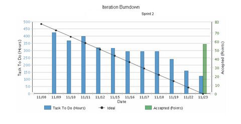
As you become more comfortable with read burning down charts, you will be able to make project status assessments in a matter of seconds. Tools such as Rally or VersionOne automatically generate these charts based on user data, or, as with one of our Agile pilots, a standard spreadsheet can be created to plot the team data.
Scrum Metrics
Metrics capture what happened in the past. With historical metrics, we hope that we can understand the past and adapt more efficiently to similar conditions in the future. While Scrum values inspecting and adapting, Scrum looks forward for iteration and release status using burn down charts.
Incidentally, my Digital Equipment Corp Software Metrics in Action pilot was deemed a success: our 18 months development project was released 1 day ahead of our original schedule. You can’t change the past, but sometimes you can predict the future...
As I look back to that period of time, I recall measuring every piece of the software development process we could identify. Our team motto was “Data tells the truth about perception.” Seriously! We measured everything. We compared task effort ‘actuals’ with ‘predicted’. We tracked our time for development, test, vacation, dentist and doctor visits, even bathroom breaks, and we had graphs for every data series. But in the midst of this data collection and evaluation there was one metric that stood out. It was the one ultimate metric that the business owners, our management, was most focused on: the “work remaining”, specifically: when can we ship?
To track the answer to this question we kept a Microsoft Project schedule that contained only the remaining work. Each day we adjusted the start date of the project each day to the current day and recomputed the remaining schedule. As more project work got completed, our knowledge grew and so did our confidence in our task estimates and our release date. By continually refining our estimates based on new knowledge, we were able to track, in “real time”, the effective project completion date on a daily basis.
My teams effort in our1990’s pilot organically stumbled upon one of the key mechanisms Scrum uses today to track project status. Scrum monitors “work remaining” by using the concept of Burn Down, and in particular, Burn Down Charts.
Burn Down Charts
There are two types of burn downs that are generally tracked by a Sprint team, the Sprint Burn Down and the Release Burn Down. They both operate similarly, but have a different scope. The Release Burn Down most closely matched my DEC pilot schedule release date monitoring, as it tracks work remaining for the entire project. The Sprint Burn Down tracks work remaining within a single Sprint, usually 2-4 weeks long. Because the Progress Agile pilots were of such short duration, each Progress pilot focused solely on Sprint Burn Down Charts.
Understanding how to interpret these charts is important. As a business owner they provide a valuable and near-instant view into the health (or status), of the current effort, be it a Sprint or Release.
Reading the Charts
A burn down chart is laid out simply: The x-axis denotes number of days in the iteration (or project), the y-axis, for a Sprint Burn, is amount of available time in hours (for a release burn down, it is story points - topic for another blog). The numbers on this axis are computed by multiplying 8 (hours/day) times the number of team members, assuming each team member is full-time on the effort.
Reading a burn down chart is fairly simple once you understand what to look for. Burn down charts show a the rate of progress of work being completed compared to the ideal rate of completion of that work. All burn down charts have one thing in common: the ideal burn down line with the ideal slope. Note the pink line in the Sprint burn down chart taken from one of our Agile pilot teams. This pink line shows the ideal rate of progress, specifically that one day of work (8 hours times the number of team members) is completed each day. There are 5 days of work, the Sprint iteration is 5 days long, and at the end of the sprint, 5 days of team work should be completed.
The pink line is boring. It’s boring because it is our control value, it’s slope is always the same. In this chart, the interesting line is the blue line. The blue line denotes the predicted remaining work for the iteration, in essence the current remaining workload of the Sprint. If everything works out as we hope, at the end of the sprint, day 5 in this example, the blue line will converge exactly with the pink line, at zero work remaining (since there is zero time remaining!). If we examine this chart on day 2 and day 3, we can see that the team is ahead of schedule, because it is below our control line. Possibly the team under-committed to work, but regardless, at day 2 it looks like they are on track to meet their commitment to complete everything they said they would. By day 4 the team is exactly on track. But something happens by day 5 because they are half-day behind. Perhaps a team member became sick or perhaps the team discovered some major unknown work at the last day. Either way, this is likely a bad example I have chosen to discuss because the team missed their commitment and everyone only found out about it the last day. The retrospective for this Sprint must surely have been interesting! This chart introduces more questions than it answers, but it encapsulates a interesting story. It turns out that this sprint was a bug fix sprint, in essence a “release sprint”, designed to produce a customer-shippable technical preview kit. Bug fixing uncovered further bugs and the team was unable to fix everything they found in time for the release, the end of the sprint.
Yes, that burn down chart tells quite a story, a thousand words, as they say, and if you are the business owner, it’s your quickest and best view into each project team.
More Examples
Let’s look at a couple more burn down charts. In this chart the team is tracking close to the ideal progress line, the black line in this chart format.
The remaining work, Task To Do blue bars, are flirting above and below the ideal. With 2 days remaining, it is likely this team complete all of their committed work. In fact, because the remaining work amount hasn’t changed the last few days, it suggests that an inquiry to the ScrumMaster might be needed to see if people simply haven’t been updating work remaining in their effort to complete the Sprint.
In this final chart below, it looks like the team has over-committed, almost from the start, and true to form, they were unable to complete a bunch of work, just over two days of work.
As you become more comfortable with read burning down charts, you will be able to make project status assessments in a matter of seconds. Tools such as Rally or VersionOne automatically generate these charts based on user data, or, as with one of our Agile pilots, a standard spreadsheet can be created to plot the team data.
Scrum Metrics
Metrics capture what happened in the past. With historical metrics, we hope that we can understand the past and adapt more efficiently to similar conditions in the future. While Scrum values inspecting and adapting, Scrum looks forward for iteration and release status using burn down charts.
Incidentally, my Digital Equipment Corp Software Metrics in Action pilot was deemed a success: our 18 months development project was released 1 day ahead of our original schedule. You can’t change the past, but sometimes you can predict the future...
No comments:
Post a Comment